The CEO’s Dashboard: How to Visualize Your Entire Innovation Portfolio for Strategic Oversight

Here’s a troubling stat:
84% of CEOs say innovation is critical to growth. Yet only 6% are satisfied with their innovation performance.
That gap isn’t about ideas or money. It’s about visibility.
Think about your sales pipeline. You can see every deal, every stage, every probability. Now think about your innovation portfolio. Can you see it the same way?
Most can’t. Innovation lives in scattered projects across marketing, engineering, IT, and R&D. Each team uses different tools, different metrics, different timelines.
The result is a black box. Money goes in. Something comes out eventually. But you can’t see what’s happening inside.
How the Three Horizons Framework Organizes Your Portfolio
Ask a cost-cutting project for immediate ROI and you’ll get it. Ask a moonshot for the same thing and you’ll kill it before it launches. Different innovation types need different measurements.
The Three Horizons framework sorts your portfolio by time and risk. Think of it as managing three different businesses at once.
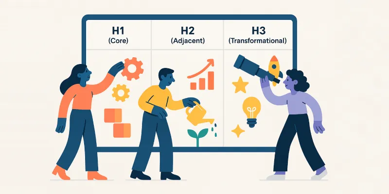
Here’s how they break down:
- Horizon 1: 0-12 months, focus on efficiency and margins, gets 70% of budget
- Horizon 2: 1-3 years, focus on growth and market share, gets 20% of budget
- Horizon 3: 3-5+ years, focus on learning and validation, gets 10% of budget
Horizon 1 defends your core business – improving what already works for customers who already buy from you.
Horizon 2 builds the bridge to your future through adjacent moves like geographic expansion or new customer segments.
Meanwhile, Horizon 3 creates what doesn’t exist yet: new business models, new technologies, new markets.
The Innovation Ambition Matrix adds another dimension. It plots projects on two axes: market novelty and product novelty.

This creates three zones (core, adjacent, and transformational) that map directly to the horizons.
Here’s the painful truth most CEOs discover when they first visualize their portfolio:
95% of projects sit in Core. There’s no future pipeline. That’s not innovation. that’s optimization wearing an innovation costume.
From Vanity Metrics to Strategic Intelligence: What to Actually Measure
Some metrics look impressive but mean nothing. “We generated 5,000 ideas this year!” So what? Ideas don’t pay salaries.
You need three types of metrics. Each answers a different question.
Input metrics answer: Are we investing enough?
These show your resource commitment:
- R&D spend as a percentage of revenue
- Full-time employees assigned to each horizon
- Innovation budget split between capital and operational expenses
Process metrics answer: Are we moving fast enough?
These show if your engine works:
- Pipeline velocity: Average time from ideation to launch
- Stage-gate conversion rates: Percentage of projects passing each gate
- Kill rate: Percentage of projects stopped at each gate (low rates are bad—they mean you’re not filtering)
Output metrics answer: Is it working?
These show real results:
- Vitality index: Percentage of revenue from products launched in the last 3 to 5 years (this is the gold standard)
- Return on innovation investment: Gross profit from new products divided by cumulative R&D spend
- Risk-adjusted NPV: The projected value of your active portfolio, adjusted for probability
Leading vs. Lagging Indicators
Revenue from new products is a lagging indicator. It tells you what worked three years ago. However, that’s useful for bonuses, not for steering.
Another is the pipeline velocity, which is a leading indicator. If it’s slowing down, you know you’ll miss next year’s targets (and now you can fix it).
Here’s how to think about the difference:
| Indicator Type | Example | What It Tells You | What You Can Do |
|---|---|---|---|
| Lagging | Revenue from new products | Did we succeed 3 years ago? | Validate strategy, reward teams |
| Lagging | Time-to-market (past projects) | Were we fast enough? | Re-engineer processes |
| Leading | Pipeline velocity | Will we hit next year’s targets? | Clear bottlenecks, add resources |
| Leading | Assumption validation rate | Are we learning fast enough? | Force faster hypothesis testing |
| Leading | Portfolio value (rNPV) | Is the future pipeline sufficient? | Initiate M&A or new R&D |
Your dashboard should show both. But when making decisions, focus on what’s ahead of you, not behind you.
The “Apples to Oranges” Solution
How do you compare a $50 million factory upgrade with a $2 million software experiment? You can’t just compare the price tags.
The factory has 90% certainty but limited upside. The software has 10% certainty but massive potential.
Risk-adjusted NPV solves this problem. The formula is simple:
Multiply the potential value by the probability of technical success, then by the probability of commercial success, then subtract the cost
Here’s a real example:
- Project A (factory upgrade): $50M value × 90% success = $45M rNPV
- Project B (AI platform): $500M value × 10% success = $50M rNPV
Project B has higher strategic value despite the long odds. This calculation could help you defend high-risk bets when your CFO pushes back.
Building Your Visual Dashboard: Three Essential Views
You don’t need to build everything at once. Here’s how to get from zero visibility to strategic control in three months.
View #1: The Risk-Reward Bubble Chart
This is your anchor view. Every major project becomes a bubble on a chart.
The X-axis shows probability of success. The Y-axis shows financial reward (NPV). The bubble size shows investment required. The bubble color shows which horizon it belongs to.
Here’s an example of what it looks like:
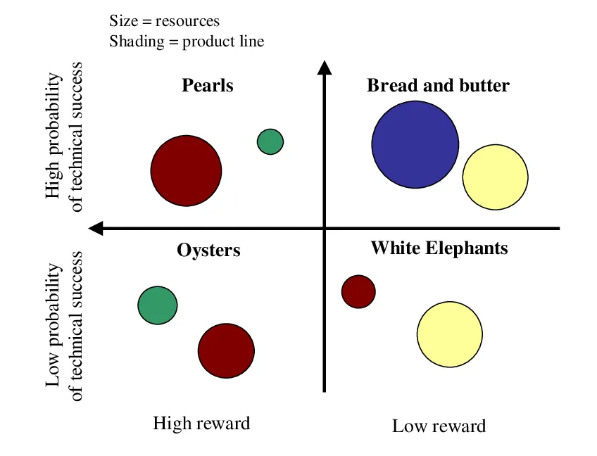
The chart divides into four quadrants:
- Pearls (upper left): High probability, high reward—your stars, fully fund them
- Oysters (lower left): Low probability, high reward—your Horizon 3 bets
- Bread and Butter (upper right): High probability, low reward—incremental updates that pay the bills
- White Elephants (lower right): Low probability, low reward—kill immediately
Now look at the spread of your bubbles. The distribution tells your strategic story.
If they’re all clustered in Bread and Butter, you’re stagnant. You’re optimizing the present while competitors build your future.
If they’re all Oysters, you’re gambling recklessly. You’ve got nothing delivering today to fund tomorrow’s experiments.
A healthy dashboard shows balance across the first three quadrants. You need bills paid, growth accelerating, and moonshots cooking.
View #2: The Growth Gap Waterfall
This chart answers one question: Will our current pipeline hit our strategic targets?
It starts with your baseline revenue today. Then it stacks bars left to right:
- Base decay: Revenue you’ll lose to commoditization over 5 years (this goes down)
- Horizon 1 contribution: Confirmed revenue from core improvements
- Horizon 2 contribution: Probability-weighted revenue from adjacent projects
- Horizon 3 contribution: Speculative value from transformational bets
- The gap: The vertical distance to your strategic target
If the gap is huge, you have a problem. Your organic pipeline isn’t enough. You need to increase R&D spending, pursue acquisitions, or lower your targets.
This visualization makes the problem impossible to ignore. It turns a strategic discussion into a math problem.
View #3: The Pipeline Funnel
The Bubble Chart shows the state of your portfolio. The Pipeline Funnel shows the flow.
Three things to watch:
- Funnel shape: Should be wide at top, narrow at bottom (cylinder shape means no filtering)
- Time-in-stage: Flag projects stuck longer than average (they’re bottlenecks)
- Conversion metrics: Low rates between stages mean you’re discovering problems too late
It tracks projects through each governance stage: ideation, business case, development, testing, launch. Each stage is a bar showing how many projects are there.
If only 20% of projects move from development to launch, something’s broken. Your governance process isn’t catching failures early enough.
The “3-30-300” Rule for Executive Design
Your dashboard will fail if it’s cluttered. CEOs don’t have time to hunt for information.
Follow this rule:
- 3 seconds: See overall health (green, yellow, red) and top 3 alerts
- 30 seconds: Understand what’s driving the problem (“European clean tech initiative delayed”)
- 300 seconds: Access full data and prepare a directive
Use color and size to draw the eye to problems.
Prioritize leading indicators over historical reports. Make the dashboard tell a story that flows from strategy to portfolio to pipeline to decisions.
Identifying and Killing Zombie Projects (The Data-Driven Approach)
Zombie projects are the walking dead of your portfolio. They failed their mission but refuse to die, consuming resources and blocking better opportunities.
Research shows that purging these projects can free up to 40% of your innovation capacity.
Your dashboard should flag zombies automatically using these necrotic markers:
- Velocity decay: Spent 150-200% of average time in current stage without progress
- Scope creep: Requirements changed 3+ times without budget or value increase
- Metric silence: No validated learning reported in 90+ days
- Resource starvation: Staffed at less than 50% of required levels
When a project triggers two or more flags, it goes on the kill list. You need a governance ritual, and most companies do this quarterly.
Three options:
- Kill it immediately and track “capital redeployed” as a positive metric.
- Pivot the strategy based on new data and reset the clock.
- Persevere with strict conditions like “Must achieve X sales by Y date or automatic kill.”
Create a “Graveyard” section on your dashboard.
Show the return on intelligence from killed projects. This destigmatizes failure and proves that learning has value even when projects don’t succeed.
Your 90-Day Implementation Roadmap
You don’t need to build everything at once. Here’s how to get from zero visibility to strategic control in three months.
Month 1: Audit and Map
Start with an inventory. List every innovation activity in your company.
Marketing’s digital pilots count.
- Engineering’s R&D projects count.
- IT’s software upgrades count.
- The corporate venture arm’s startup investments count.
Tag each project by horizon. Is it H1, H2, or H3? Be honest.
Calculate your current allocation. How much budget and talent goes to each horizon? Compare it to the 70-20-10 benchmark.
Most CEOs discover they’re at 95-5-0. That’s your wake-up call.
Month 2: Visualize and Cleanse
Now plot everything on the Innovation Ambition Matrix. Core, adjacent, or transformational?
Create your first Risk-Reward Bubble Chart. You’ll see the White Elephants immediately. They’re obvious once you visualize them.
Apply the Zombie Index to your full portfolio. Flag projects that show multiple necrotic markers.
Here’s the hard part: kill the bottom 25%. Yes, really. Free up that capital for redeployment.
Month 3: Automate and Govern
Don’t force everyone to use one tool. That fight will take a year and you’ll lose.
Connect your existing data sources instead.
- Engineers can keep using Jira.
- Finance can keep using SAP.
- Chemists can keep using their lab information system.
Your dashboard sits on top.
It pulls unified strategic metrics from these disparate systems. This “federated” approach keeps data accurate because teams work in their native environments.
Use a business intelligence tool like PowerBI or Tableau for the visualization layer. These connect to everything through APIs.
Institute your quarterly Growth Board meeting.
The dashboard drives the agenda. The goal isn’t to review every project. It’s to make the three to five decisions that matter most.
From Passive Observer to Active Architect
The CEO’s dashboard transforms innovation from a black box into a strategic control tower. Companies that actively reallocate capital deliver returns 40% higher over 15 years.
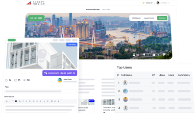
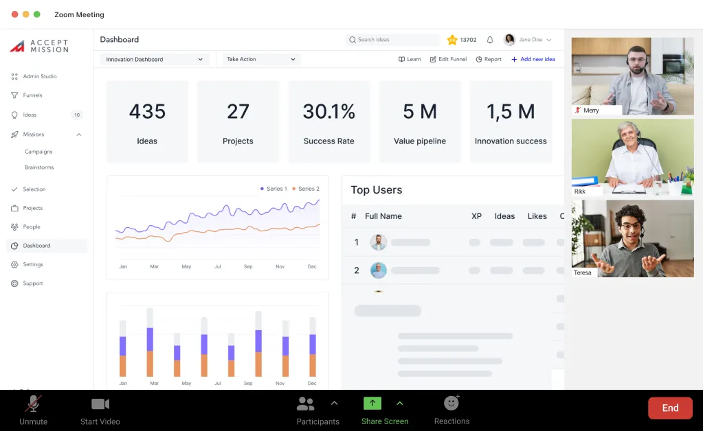
Accept Mission provides a purpose-built platform for strategic portfolio oversight.
The software operationalizes everything in this article from Three Horizons visualization to zombie detection without custom solutions.
Here’s how Accept Mission helps you build your CEO dashboard:
- Real-time portfolio views: Visualize projects across Horizons, departments, and strategic themes
- Pre-configured dashboards: Leading and lagging KPIs ready out of the box
- Multiple visualization options: Gantt charts, Kanban boards, bubble charts, and funnel views
- AI-powered insights: Automated trend detection and predictive analytics
- Stage-gate automation: Workflow triggers, scoring, and automated project movement
- Power BI integration: Connect your innovation data to company-wide reports
- Task management: Automated reminders and progress tracking across your portfolio
The platform is modular.
Start with what you need today and expand as your system matures. Even an imperfect audit reveals forgotten projects, duplicated efforts, and gaps in your future pipeline.
Ready to turn your black box into a strategic control tower? Book a demo with Accept Mission today.